
Free trials are about giving customers confidence. Nobody wants to spend money without knowing what they’re buying—or if what they’re buying does what they need.
That’s why a free trial can be your best sales pitch. It puts potential customers in the driver’s seat, so they can experience your product for themselves. Meanwhile, onboarding puts you in the passenger seat, telling them more about the product and helping them get the most from it.
So how do you make that happen more often? There’s more than one way to increase free trials, and in this roundup we’re going to discuss the strategies 10 companies used successfully. These are all real case studies about free trials, with real companies and real data.
Here’s what we’re looking at:
- DropBox: Referral program got 4 million users in 15 months
- Groove HQ: Simplified pricing increased conversions by 358%
- Wedbuddy: Removed “free” from their free trial offer
- Cloudways: Seasonal exit-intent popups
- Crazy Egg: Answering questions before customers ask them
- BigContacts: Optimized pricing page to drive free trials
- Weather Channel: A/B testing from 10 years ago
- MyVR: New homepage video increased trials by 34%
- Groove HQ: 10% of all blog subscribers start a free trial
- GetResponse: Side-by-side free trial and buy buttons
- Honorable mentions
Enjoy.
1. DropBox: Referral program got 4 million users in 15 months
Industry: Cloud hosting service
What they did:
- Built a referral program into their onboarding process.
What happened:
- Permanently increased signups by 60%.
- Grew from 100,000 users to 4,000,000 users in 15 months.
Where the case study came from: In 2014, ReferralCandy analyzed DropBox’s legendary referral program on their blog.
Even if you’ve never used DropBox before, you’ve probably seen one of their referrals in your inbox. ReferralCandy reports that in April 2010, DropBox users sent out 2.8 million direct referral invites. And that was when they’d just crossed the one million user mark.
Today, there are about 200 million more DropBox users than there are people in the US. And their referral program is still alive and well. If you’re serious about growth marketing, you can’t afford to overlook this beautifully simple system.
While it’s pretty common for SAAS products to incentivize referrals with something like a free month, referring your friends and family to DropBox makes your account more valuable. Free users automatically get 2 gigabytes of cloud storage, and every referral earns you an additional 500 megabytes.
ReferralCandy remarks that for every referral program, “the optimal currency is the lifeblood of the product.”
The case study makes several keen observations about what likely made DropBox’s referrals so successful.
For starters, the referral program is part of the gamified onboarding process.

You haven’t completed the basics of DropBox until you’ve invited some friends. (Image source: ReferralCandy)
Part of what makes this work is that the referral program is framed as a benefit to the user. “It wasn’t positioned as ‘Invite friends’ but ‘Get more free space’. This is the key to some of the most successful referral campaigns,” ReferralCandy says.

DropBox also gamified other key actions. Here these are listed as “free” ways to get something you’d otherwise have to pay for with cold hard cash. (Image source: ReferralCandy)
DropBox made it as easy as possible for existing users to refer their friends. All people had to do was click a button to share a link. After they invite someone, DropBox lets people see the progress of their invite. It’s like tracking a package.

DropBox isn’t telling people to follow up with their friends, but let’s be honest, if you see that your buddy Tyler hasn’t installed this free thing which gives you a better free thing, you’re going to bug him about it. Come on, Tyler. (Image source: ReferralCandy)
Nobody likes to think their work is going into an abyss. This nifty little bonus tracker serves as a monument to the value of all a user’s referrals. Every single one is right there, demonstrating its worth.
And finally, ReferralCandy points out that DropBox takes every opportunity to “keep the viral loop strong.” When friends accept an invite to DropBox, the confirmation email prompts them to start inviting their friends.

Before you’ve even done anything with your space, they’ve already got you thinking about how to get more. (Image source: ReferralCandy)
Note: DropBox was failing hard at AdWords. It was costing them $233-$388 to acquire customers for a $99 product. Who knew that for a few measly megabytes, people will advertise for you!
2. Groove HQ: Simplified pricing increased conversions by 358%
Industry: Support software
What they did:
- Tested several very different pricing models.
- Added a pricing comparison page.
What happened:
- The final pricing model converted 358% more free trials than the original.
- Increased revenue by 25%.
- Price comparison tool increased conversions by 16%.
Where the case study came from: Groove HQ shared this case study as part of their “journey to 100K a month” series.
Sometimes your pricing page just needs a little design work. Maybe the information isn’t organized clearly, or there’s too much or not enough of it. But what if a totally new pricing model would result in more free trials and revenue?
For Groove HQ, nothing was set in stone. They wanted to develop a “disruptive” model that offered competitive pricing and allowed customers to pay in the way that worked best for them. So they started from scratch with a freemium, flexible model.

While this let customers choose a “pay-as-you-go” option, it was too confusing to convert. (Image source: Groove HQ)
This highly flexible pricing page model converted at 1.11 percent. It was hardly the game-changer Groove was looking for.
“Our ‘unmatched flexibility’ was costing us customers,” says CEO Alex Turnbull. “We had to change direction. . . . Making your customers work to understand your pricing is never the right approach.”
To understand the disconnect, Groove decided to ask their customers directly—”How would you prefer to pay?” They only surveyed 30 customers, but 11 of them gave a response like this:

Even with a small sample size, this many customers saying the same thing has to count for something, right? (Image source: Groove HQ)
“People wanted to pay for the number of support tickets they handled, not the number of agents on their team,” Alex says.
So they took that feedback and produced . . . something even more complicated.

All of these plans let your entire support team jump in for no extra cost, but now your price could change month to month, depending on how many tickets you have. (Image source: Groove HQ)
The new page had a 1.17 percent conversion rate. Barely an improvement.
“Even though people told us that this approach would make them happy, when we dug deep and asked site visitors for honest feedback, we found that they ended up being scared about the uncertainty of never knowing what they’d be paying in a given month,” Alex says.
The flat pay-per-ticket option from the previous pricing model would’ve been a simpler route, but that isn’t feasible for large companies. So while customers said they preferred a per-ticket option, it wasn’t panning out.
Alex and his team finally had a realization:
“If our uniqueness comes from being the simplest, easiest app, then our pricing has to reflect that, too.”
So they tried one more time.

Now people only had to make one decision: “Do we get Groove, or not?” (Image source: Groove HQ)
This straightforward model converted at 4.15 percent—more than triple the previous model.
Once Groove settled on a pricing plan, they created a comparison page to make the decision a little easier for potential customers.

The more users you have, the more appealing Groove’s new price becomes. (Image source: Groove HQ)
Implementing the comparison page increased trials by 16 percent.
The moral of the story? Test everything. Even if you’ve already put a lot of research into developing your ideal pricing scheme, experimentation might reveal another model that converts better. This is textbook growth marketing.
3. Wedbuddy: Removed “free” from their free trial offer
Industry: Wedding websites
What they did:
- Changed the copy to focus on value, not payment structure.
- Reduced length of homepage by about 33%.
What happened:
- Increased clicks on the CTA by 139%.
- Increased trial signups by 73%.
Where the case study came from: Growth Rock and SingleGrain teamed up to optimize Wedbuddy.com, and Growth Rock shared the results on their blog.
How many times have you seen messaging like this:
“Free 14-day trial. No credit card required.”

This is what we like to call a cookie-cutter-CTA. (Image source: Growth Rock)
While this is classic SAAS, Growth Rock realized that this call to action was a wasted opportunity to reinforce what Wedbuddy actually does, and it was also a reminder of something visitors weren’t ready to think about:
“For many products, but especially apps and software, emphasizing your free trial often serves only to remind your customers that it’s actually not free . . . eventually you will reach for their wallet . . . and they don’t want to deal with that.”
So instead, they changed the CTA to focus on the reason people came to Wedbuddy.com in the first place:

That’s better. (Image source: Growth Rock)
Growth Rock also had a hunch that the homepage was trying to do too much at once. Wedbuddy was cramming in a features section, too. So they cut about one third of the homepage.

Sometimes longer pages are better. Sometimes shorter pages are. You won’t know what works best for you until you test. (Image source: Growth Rock)
Unfortunately, it looks like Growth Rock tested multiple variables at once. So while the results are impressive—139 percent more clicks on the CTA and 79 percent more free trials—they can’t definitively say if both changes had a positive impact. My guess is that the updated CTA had the biggest impact. But unless you test for one variable at a time, you simply don’t know.
Suppose that the net result was negative. When you run a test with multiple variables in play, all you really learn is “we did something good in this variation” or “we did something bad in this variation.” But you can’t point at any one factor as definitively positive or negative. And that’s bad. You’re missing opportunities for easy wins.
Interestingly, Growth Rock makes a point of explaining some of the research that led to their hypothesis, but the research they highlighted doesn’t appear to support the changes they made. Specifically, Growth Rock says that they dug around on wedding forums and identified a feature brides need, which Wedbuddy provides.
Then they cut the features section from the homepage. *shrug*
4. Cloudways: Seasonal exit-intent popups
Industry: Cloud hosting service
What they did:
- Modified exit intent popup to present yes/no opt-in.
- Created holiday-specific and seasonal opt-ins.
What happened:
- Increased free trial signups by 120%.
Where the case study came from: OptinMonster shared this case study on their blog.
I’ve never heard a single person say, “Hey, you know what? I like popups.” And I doubt you have, either. Still, they’re ubiquitous. Because when done well, they work. You just have to decide if the benefit of new customers in the pipeline outweighs the shame of being kind of annoying.
As a savvy young SAAS company, Cloudways knew that if they really wanted to grow, they had to test out every possible strategy. So they turned to OptinMonster to experiment with exit-intent popups.
Their first experiment didn’t go well.

Not surprisingly, most people didn’t wait. The only things this popup tells you are: 1. Something is free. 2. It’s limited. So hurry! (Image source: OptinMonster)
Only 0.21 percent of all people who saw this popup signed up for a free trial. But a single test isn’t enough to rule out popups altogether. So they decided to implement what OptinMonster calls a “yes/no opt-in.”
You’ve probably seen these before. Yes/no opt-ins “force the reader to confront the consequences of choosing not to take the offer presented.”
Exhibit A:

I’m going to go ahead and call this over-promising. (Image source: OptinMonster)
This popup performed significantly better, resulting in a 3.80 percent conversion rate. But the yes/no opt-in obviously isn’t the only difference between those two popups. This one lists a couple specific features, and more importantly, promises a 100 percent faster website. (Can they really deliver on that? I don’t know.)
Cloudways also used several seasonal exit-intent popups. These had mixed results (none were nearly as bad as the first one though). The best performing seasonal popup was for Halloween:

Note: An exit-intent popup is literally the last people will see when they leave your website. Think carefully about what you want them to associate with your brand. (Image source: .OptinMonster)
3.77 percent of visitors who saw this popup went on to start a free trial.
Altogether, these popups resulted in a 120 percent increase in free trials. Even if you decide popups aren’t right for your brand, this case study is a good exploration of ways to manufacture urgency and reinforce the value of signing up for a free trial.
OptinMonster seems to put more emphasis on the value of the “no” piece of the opt-in, but do you really want to bully your customers into trying your product? I’d be willing to bet that the benefit-oriented button had a much bigger impact. (But they tested too many variables so we’ll never know.)
Note: It doesn’t look like Cloudways is using exit-intent popups anymore. Perhaps they learned that popups can negatively impact your SEO? Popups are especially obnoxious on mobile, and Google favors sites that provide the best mobile experience.
5. Crazy Egg: Answering questions before customers ask them
Industry: Heat map software
What they did:
- Used Qualaroo on the trial page to determine why people were hesitating.
- Addressed major concerns in the checkout process.
What happened:
- Increased trial signups by 116%.
Where the case study came from: Conversion Rate Experts shared this case study on their website.
Conversion Rate Experts made a lot of changes to Crazy Egg’s website. In the case study, they say that these changes added up to a 363 percent increase in the website’s conversion rate. But we’re going to focus on what they specifically did to increase free trial signups.
At some point, every SAAS company asks, “Should we require credit card information before people sign up for a free trial?” Conversion Rate Experts used Qualaroo to survey people during the final signup process. They discovered that the biggest barrier to signing up was this classic hurdle.

The original checkout page left people wondering, “Why do they need my credit card information if it’s free?” A question every SAAS startup has probably heard once or twice. (Image source: Conversion Rate Experts)
Crazy Egg didn’t want to lose all those potential customers, but they also knew that collecting credit card information early can increase the free trial conversion rate. So they didn’t make it an either-or situation. Instead, they decided to address known concerns upfront.
Here’s what their new page looked like:

The updated sign up page answered three of the common questions that came up through Qualaroo. (Image source: Conversion Rate Experts)
“This last win powerfully illustrates our principle of ‘unblocking arteries,’” Conversion Rate Experts say. “Many visitors previously were ready but not-quite willing to convert on the free-trial page, and were being blocked by objections that had not been addressed. By overcoming the objections, we eliminated the blockage, and sales flowed.”
While you can certainly follow Crazy Egg’s model, it’s worth noting: this would have been a more powerful example of “unblocking arteries” if they had removed the credit card requirement altogether.
After working with more than 100 SAAS companies, Totango concluded that free trial pages that require a credit card convert at about 2 percent of visitors. Meanwhile, free trial pages that don’t require credit cards convert about 10 percent. Obviously, there’s a lot less friction to starting a free trial that way. Or less blockage in the arteries, I guess.
Loosening the requirements here does lower your free trial conversion rate—those freeloaders do eventually have to give you their credit card information—but that’s not a big deal if you have 500 percent more people coming down the pipe. The end result, according to Totango, is 100 percent more overall conversions from visitor to customer. (You can gobble up the rest of Totango’s data in their conversion benchmarks guide.)
6. BigContacts: Optimized pricing page to drive free trials
Industry: CRM (customer relationship management)
What they did:
- A/B tested which pricing plan was most appealing to potential customers.
- Made the free trial offer more prominent.
What happened:
- Increased visits to the free trial page by 76%.
Where the case study came from: BigContacts turned to Surge Labs for optimization help, and Surge Labs shared the case study on their website.
BigContacts had the right pieces, but they weren’t in the right places. They weren’t sure what their most appealing offer was, so they took the shotgun approach and made a mess of their pricing page. (Plus, the company was founded in 2007, but the page looked like it was designed in the 90s)
Check it out:

The only mention of the free trial is well below the fold. The actual page was about twice this long. (Image source: Surge Labs)
“The BigContacts existing pricing page was confusing and had a lot of miscellaneous information on the page that diluted the pricing message and got in the way of prospects signing up for the free trial,” Surge Labs says.
They started by A/B testing three variations of the pricing page, each one making a different option (free, monthly, or annual) more prominent. They also gave the page a much-needed facelift.
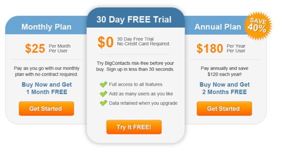
The free trial offer was now one of the first things people would see. (Image source: Surge Labs)
Interestingly, the version of the pricing page that highlighted the annual plan drove the most people to the free trial page—76 percent more than the original version.
Here’s the final page they went with:

Despite being much more streamlined, the new pricing page wasn’t much leaner. It was still about as long, because they added a FAQ section below the feature comparison chart (not pictured). (Image source: Surge Labs)
Surge Labs’ case study of Big Contacts shows that when people are looking at your price tag, they’re obviously going to gravitate to the free option. If you try to hide your free trial option by making your pricing more prominent, you’re simply going to have fewer people trying your product.
Unfortunately, this case study could’ve been a lot more helpful, and I’m left with this burning question:
Why did Surge Labs share statistics about the number of visits to the free trial page, instead of the number free trials?
It’s possible that BigContacts’ whole website was going through a much larger-scale redesign, and so there were too many variables for them to attribute an increase in trials to these changes.
At one point Surge Labs mentioned, “The BigContacts home page has a lot of competing content and we needed to create a visual and messaging emphasis on driving click-thrus (sic) on the Free Trial button.”
But since the case study doesn’t say anything more about this, it’s hard to know what other changes were being made to optimize the top of the funnel.
7. Weather Channel: A/B testing from 2008
Industry: Weather forecasting
What they did:
- A/B tested headings, copy, buttons, and images.
What happened:
- Increased free trials of their severe weather warning system by 225%.
Where the case study came from: MarketingSherpa shared this case study on their website at the beginning of 2008—more than 10 years ago.
You might be wondering why we’re referencing a 10-year-old case study. You might also be wondering, “If people knew A/B testing was important 10 years ago, why do I still have to convince people to do it?” That’s the real question.
The Weather Channel wanted to get more people to use their severe weather warning system, Notify!, but they were having trouble visually explaining what it does. So they talked to existing customers to find out why they used it, and learned that most people sign up to receive tornado warnings.
They aligned their landing page with this insight into their audience, adding tornado imagery and messaging that walked through how Notify! works in that scenario. Then, they tested variations of:
- Headings
- Images
- Supporting copy
- Other types of severe weather
- CTAs
- Button colors
- Font size
The result was a 225 percent increase in trials.
“We can’t take results and say, ‘Now we need a flat red button on every page.’ For each page, each product and each customer experience, you’ve got to individually test it,” says Brad Bacon, director of distribution and consumer applications. “Yes, we can’t forget something we learned here, but we can’t assume it’s going to work for every product and every page.”
By the way, if you’re the kind of person that’s into testing things like button color, you should know: the color itself isn’t what matters. (According to NASA.)
8. MyVR: New homepage video increased trials by 34%
Industry: Vacation rentals
What they did:
- Added a video to their homepage.
- Promoted the video on social media.
What happened:
- Increased free trials by 34%.
Where the case study came from: Adelie Studios produced the video for MyVR and shared the case study on their website.
Sometimes the fastest way to understand something is to watch a video about it. Adding a video to your homepage gives you the opportunity to put your service in the context of a story, and visually connect with the problems your website visitors face.
This can be especially valuable if your product or the problem you’re trying to solve is complicated. Instead of having to dig around your website or scroll for a few minutes to figure out what you do and how it connects to them, visitors can just watch a quick video.
That’s why MyVR reached out to Adelie Studios to create a video. While branding plays a big role in what any given video should look like, Adelie Studios also wanted the design to contribute to the message of the video.
“From the main characters, to the houses and background, down to the iconography; we wanted all visuals to keep that sketch and simple design aesthetic throughout. All the visuals were intentionally designed to augment the ‘simplicity’ message we were conveying through the script.”
Here’s what they came up with:
Unfortunately, the case study doesn’t say if the video increased the conversion rate of the homepage. It says “The net result was that following the launch of the video, trial signups spiked dramatically and overall there has been a 34% increase in trial signups since the video was implemented on the home page.”
Promoting the video on social media likely contributed to the spike in trials, but the sustained impact of the video would come from an increased conversion rate on the homepage, not just an increase in trials.
Either way, the video condensed MyVR’s message into an easily consumable format, and trials signups remained higher after the video was added.
9. Groove HQ: 10% of blog subscribers start a free trial
Industry: Support software
What they did:
- Used email onboarding on their newsletter to drive free trials.
What happened:
- 10 percent of all blog subscribers start a free trial.
Where the case study came from: Groove HQ wrote about their email onboarding campaign on their blog. The case study includes a section specifically about how they used their newsletter to increase free trials.
Yup. Groove HQ again. We’ve talked about their onboarding emails before, but this time we’re going to focus specifically on how they leveraged this channel to increase free trials.
Every single person who signs up for Groove HQ’s newsletter goes through this onboarding flow before they get anything else:

Some companies have a flow like this: pitch, pitch, pitch, pitch, pitch, pitch. Don’t be like them. (Image source: Groove HQ)
Groove knows that they benefit the most from building long-term relationships with their blog subscribers, and how they handle these first few emails sets the tone for the relationship.
So they take their time providing subscribers with relevant, valuable information. When they finally get around to “making the ask” 12 days later, subscribers are:
- More receptive to the pitch because they trust Groove’s expertise and have received other valuable content from them.
- Less likely to unsubscribe because they want more of the valuable content that came before the pitch. This means there are still more opportunities to make pitches in the future.
Here’s the pitch that converts 10 percent of all their blog subscribers into free trials:

Groove’s sales pitch is framed around value, not features. Even though they’re finally asking subscribers to do something, it still feels like Groove is giving them something. (Image source: Groove HQ)
Every blog post Groove HQ writes feeds into the newsletter signup, which feeds into the free trial signup. If you don’t already have an email onboarding campaign that culminates in a promotion for your free trial, you’re missing out on a permanent stream of new trial users.
10. GetResponse: Side-by-side free trial and buy buttons
Industry: Email service provider
What they did:
- Added a “free trial” button to their homepage.
What happened:
- Increased free trials by 158% without decreasing purchases.
Where the case study came from: Visual Web Optimizer shared this case study on their blog in 2011.
Suppose you’re at a car dealership, ready to buy, and a salesperson shows you two identical cars and tells you, “You can have this one for free, or you can buy this one.” Obviously, everyone is going to take the free car.
This is the way some marketers look at their pricing or home page. “Why would you tell someone they can have it for free if they might be ready to buy?”
So they design pages like this:

When you get to this page, the only way to try the software is to buy it. (Image source: Visual Web Optimizer)
The problem is, not everyone is here because they’re ready to buy. And a car salesperson isn’t going to give you a new car, but they’ll let you test drive it to help you decide if this is the one you want to buy.
GetResponse wanted to increase free trials, but they were worried that adding a free trial button to their homepage would negatively impact sales. But without data, they weren’t going to let that fear cause them to miss a potential increase in free trials. So they tested it.

Now there’s an option for people who are thinking about GetResponse, but aren’t ready to pay for it. (Image source: Visual Web Optimizer)
Obviously, having a free trial button is going to result in more free trials than not having one. On the previous homepage, people only found a free trial if they were willing to hunt for it. (It’s unclear if it was on the pricing page or if they had to use the search bar.) After GetResponse added the button, there was a 158 percent increase in free trials.
But what surprised GetResponse is that the button didn’t result in fewer sales. (It sounded like there may have been a small decrease, but they didn’t share any data here.) People who were ready to purchase were still going to buy. They didn’t waste time dipping their toes in the water with a free trial.
Even if you experience a dip in sales though, when you factor in the massive boost of free trials and the free trial conversion rate, you’re probably still going to see a net gain over time.
“We expected that by adding a free trial button on the homepage the number of paid accounts would decrease,” GetResponse says. “We were positively surprised by the results. Not only did we manage to keep the sale [sic] at the same level, but we also noticed a huge increase in the number of free trial accounts, which will also result in a bigger number of upgrades in the future.”
Honorable mention: PayPal: The first big referral program
Industry: Ecommerce platform
What they did:
- Paid users real money when they got their friends to sign up.
- Spent $60 million on new users.
What happened:
- Gained 100,000 users in the first month the website was live.
- Saw daily increase of 7–10 percent more people using the platform.
Where the case study came from: ReferralCandy analyzed PayPal’s referral program on their blog in 2016.
PayPal’s referral program was actually the model that DropBox’s program was based on. While it doesn’t always get as much attention, it’s certainly worth exploring this little marketing history lesson.
Since people use PayPal to, well, pay for things, they needed to get people to spend money on the platform. Like DropBox, their advertising efforts weren’t panning out, so they tried something else: paying people to sign up and to refer friends.
“Initially users just had to sign up, confirm their email address, and add a (unique, authorized) credit card,” says David Sacks, original COO of PayPal. “The money was simply added to their account. This was real money. Users could send it to someone else or withdraw it. So it was a real cost to PayPal. We must have spent tens of millions in signup and referral bonuses the first year. . . . The bonuses were gradually phased out, first by reducing them to $5, then by adding more verification hoops (like bank account verification) so they became more difficult to get. Then they were eliminated altogether.”
Check out the case study to see how they made this work, and why they stopped it.
If you’re interested in referral programs, ReferralCandy has 47 examples of how companies from different industries have pulled them off.
Honorable mention: Dating site gets a new look
Industry: Dating
What they did:
- A/B tested a romantic image of a couple vs. a conglomerate of individuals.
What happened:
- Increased signups for free trials by 38%.
Where the case study came from: Conversioner shared this case study about an unnamed Asian dating site on their blog.
The whole point of a dating site is to help you find your match. But everyone has their own idea of what they want in a relationship. So when a dating site presents a specific couple in a specific setting, it’s easy for people to feel like “this is for me,” or “this isn’t for me,” based on what kind of relationship is represented.
Even if that image isn’t at all representative of what your experience would be like, it communicates something about the type of experience the site is trying to facilitate, which can feel prescriptive, even when it’s not.
Conversioner set out to optimize the homepage of an Asian dating site to increase their free trials. They tested two variations of the homepage. One was prescriptive, the other was not. Guess which one did better?

If you ask me, this romantic getaway scene makes this feel like you’re about to make a huge commitment. (Image source: Conversioner)
This one is less intimate, but also less intimidating:

This image lets people consider the variety of people they might connect with and lets them imagine what their unique relationship might look like. (Image source: Conversioner)
This image increased signups by 38 percent.
Conversioner makes a big deal about what they call “emotional targeting” and “emotional conversion optimization,” but they don’t really explain what that means or how it plays out in this case study. The real takeaway here is that the homepage image that performed the best was the one that gave visitors the most freedom to insert themselves into the narrative.
What does this all mean for your free trial program?
Just about any marketing tactic in the book can be used to increase free trials. We looked at how other organizations have used some of them successfully, but you might also want to explore the possibilities of strategies like retargeting, or tools like chatbots.
Whatever tactics and tools you use, test everything. Don’t go all in on a hunch, and don’t miss an opportunity based on assumptions. Maybe a new pricing model would lead to more trials (and thus, sales). If you haven’t tried a referral program, maybe it’s time to give it a shot. (Or reconsider what went wrong last time you tried it.)
If you want help coming up with some ingenious ideas for increasing trials, or you’re not sure how to implement these strategies in the context of your product, let’s talk.